What you’ll take away
- Headings describe subjects and their hierarchy; landmarks describe major page areas.
- Keyboard focus, structural reading and interaction modes are different parts of navigation.
- Use the command map for the actual screen reader, platform and current mode.
- Clear link names help readers choose destinations; context-based accessibility requirements need their own interpretation.
- Preserve the content order where it affects meaning, and record concrete observations when reviewing a page.
A page has more than one way to show its organisation
Imagine opening a museum guide with a large title, coloured panels and a tidy sidebar. You can see where the ticket information begins. A screen reader needs information it can recognise in the page, rather than an assumption that the largest letters must be a heading. Proper headings and named page regions give it useful places to navigate. A visually convincing layout can therefore leave a reader with much less useful structure than its designer intended. [1][2]
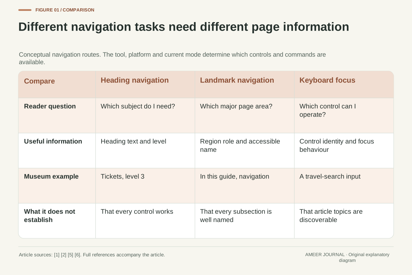
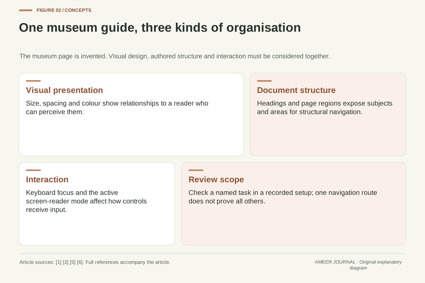
This article uses an invented museum guide to follow three different tasks: finding a topic, moving to a major page area, and reaching a control. These tasks need related but different information. A heading explains where a subject begins. A landmark identifies an area such as the main content or a group of navigation links. Keyboard focus allows interaction with controls. A useful page supports all three without making the reader guess which coloured box matters. [1][2][6]
The examples explain documented behaviour, not a completed accessibility audit of a particular website. The NVDA guide retrieved for this article identifies itself as version 2026.3; the Apple examples concern VoiceOver on Mac. Settings, browsers and document types can change the available commands. [5][6]
Visual grouping, document semantics and keyboard interaction are separate aspects of a page. Typography can indicate a section to a sighted reader, while structural navigation depends on information exposed programmatically. WAI documents heading ranks and landmark roles as mechanisms for communicating that organisation. A layout can therefore be coherent in a screenshot yet provide a poor set of navigation targets when headings or regions are absent, misleading or incorrectly labelled. [1][2]
The worked example is a fictional museum guide. Its information architecture has a topic hierarchy, a set of page regions and a set of interactive controls. These are not interchangeable inventories. The heading outline answers which subject contains another; landmark navigation answers which major area is being visited; focus movement supports operating controls. Evaluating one inventory does not establish that the other two are usable. The distinction is especially helpful when someone reports that keyboard access works but finding the article remains difficult. [1][2][6]
This is a mechanism explanation using documentation, not an empirical assistive-technology compatibility report. The retained NVDA source is titled NVDA 2026.3 User Guide, and the Apple source describes VoiceOver on Mac. Commands and presentation depend on the application, configuration and supported document. [5][6]
Use heading levels to describe a relationship
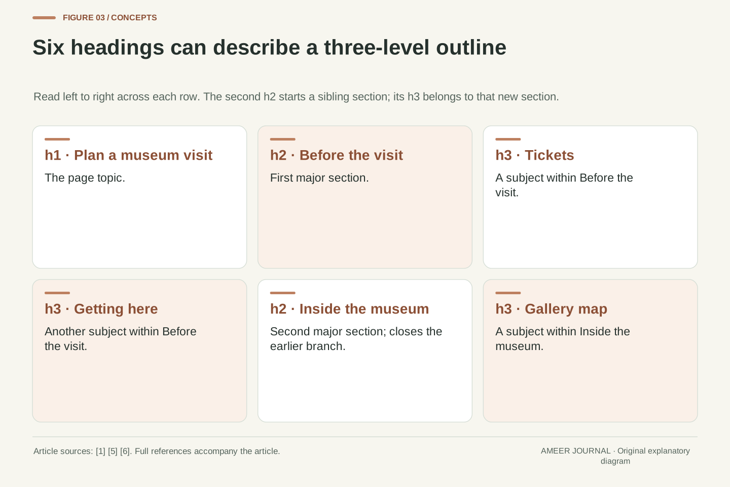
A heading is more useful when it tells the reader both its subject and its place in the page. HTML supplies six heading levels, h1 through h6. In our museum example, “Plan a museum visit” is the main heading. “Before the visit” and “Inside the museum” are sections beneath it. “Tickets” and “Getting here” belong within “Before the visit”. Their levels express these relationships; the size or colour chosen for their lettering is a separate design decision. [1]
The resulting levels are h1 for the page title, h2 for each major section, and h3 for the smaller subjects inside a section. Choosing h4 merely because its default appearance looks right would give the reader a different hierarchy. WAI advises avoiding skipped ranks when opening subsections, such as moving directly from h2 to h4. Returning from a deeply nested subsection to a new h2 is different: it closes that branch and starts the next main section. [1]
Now consider someone who needs ticket information without hearing every introductory paragraph. A heading list can expose “Tickets” directly, provided it is actually a heading. A bold sentence that looks identical may not supply that target. Conversely, marking every short sentence as a heading produces a crowded outline. In this example, headings earn their place by introducing useful subjects; the paragraphs beneath them carry the detail that someone can read after reaching the right subject. [1][5]
HTML heading ranks encode a hierarchy with h1 through h6. For the fictional guide, h1 identifies the document topic, two h2 elements identify major divisions, and h3 elements identify topics nested within those divisions. The structural choice precedes the typographic choice. Changing a heading rank to obtain a preferred font treatment changes the outline that heading-oriented navigation can expose; styling the correct semantic level preserves the intended relationship. [1][5]
A sequence h1, h2, h3, h3, h2, h3 is coherent for this example. The second h2 closes the preceding h3 branch and starts a sibling of the first h2. It does not require inserting an empty intermediate heading. WAI distinguishes this valid return to an earlier rank from skipping an intermediate rank when opening a deeper subsection. Its guidance also allows stable ranks in fixed page sections, where consistency across pages can matter more than matching the depth of the changing article. [1]
The outline should compress the information architecture without replacing the content. A reader selecting Tickets from a headings inventory should reach the section that explains tickets, not an unrelated promotional card. A heading repeated several times with an identical name may still have a valid level but provide weak orientation. Evaluate names and nesting together: the level describes containment, while the text describes the subject. Neither a large font nor the mere presence of multiple heading elements establishes that this pair is useful. [1][5]
Follow one reader through the museum guide
Here is the complete small outline used in our example: “Plan a museum visit”; beneath it, “Before the visit”, with “Tickets” and “Getting here”; then “Inside the museum”, with “Gallery map”. That gives six headings, but only three levels. Six headings do not mean six equal sections. Someone browsing the outline can understand that travel information belongs to planning the visit, while the map belongs to being inside the building. [1][5]
Suppose the reader already has a ticket and wants the map. They can choose “Gallery map” from the available headings rather than work through the ticket paragraphs. Another reader may first visit “Before the visit” and then read its subsections in order. This is the practical value of meaningful section names. [1][5]
The example also reveals a useful editorial check. Read only the six heading names and ask whether they still describe the page. If the list becomes “Welcome”, “Discover”, “More” and “Explore”, the outline may be attractive marketing copy but offer little help choosing a destination. Keep the headings specific enough that a person can reasonably predict the information beneath them.
The example outline contains six nodes: h1 Plan a museum visit; h2 Before the visit; h3 Tickets; h3 Getting here; h2 Inside the museum; h3 Gallery map. It has one root, two second-level branches and three third-level subjects. This is an original structural example, not an extracted museum website. It makes the hierarchy inspectable independently of any desktop grid, mobile card order, type scale or decorative treatment. [1]
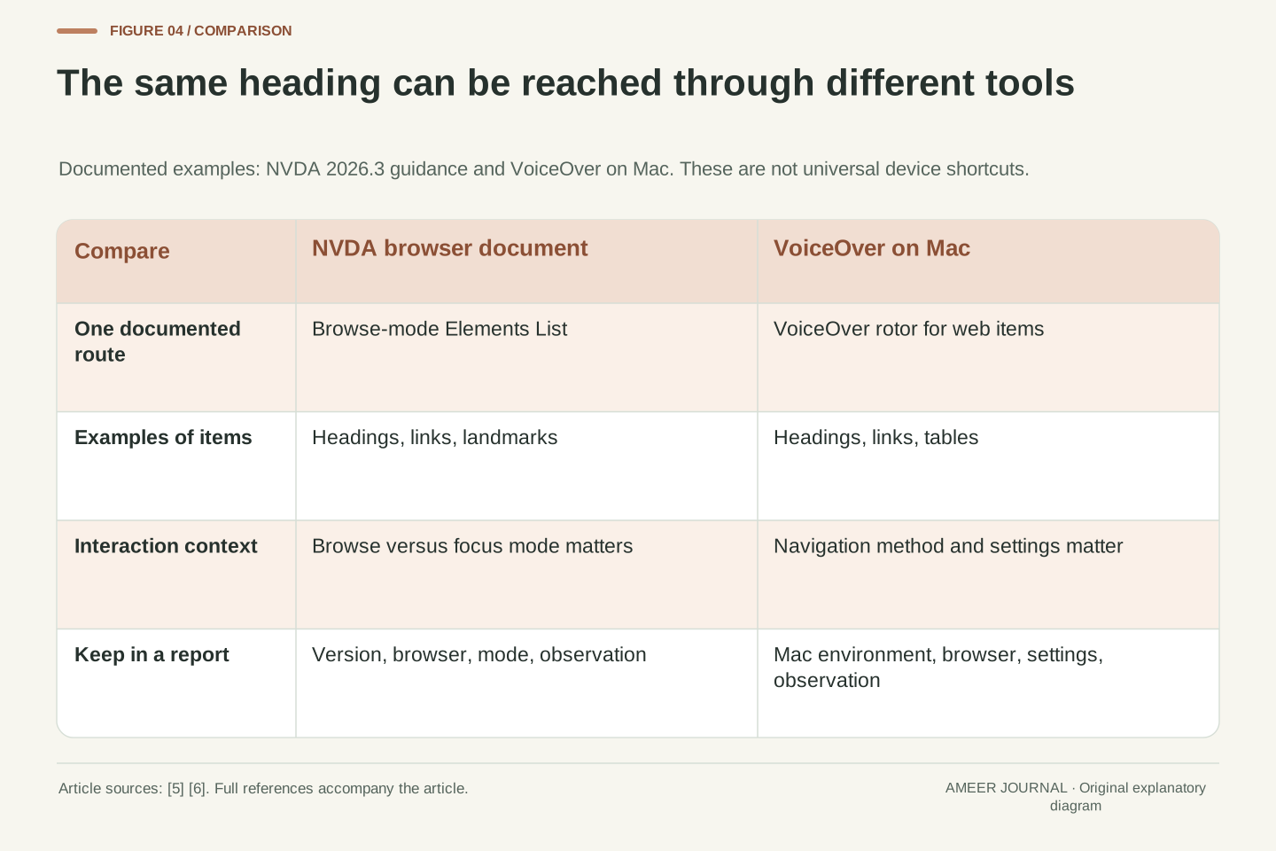
Consider two navigation intentions. A reader with a specific target can select Gallery map from an available heading inventory. A reader seeking an overview can visit Before the visit and continue through its contained subjects. NVDA documents an Elements List that can expose headings in a browser document, while VoiceOver on Mac documents a rotor that can navigate web headings. [5][6]
A useful review separates structural correctness from information scent. The six-node tree can be correctly nested yet badly named. Replacing Tickets with Discover more preserves the tree but weakens the prediction available before navigation. Conversely, an informative Tickets label cannot repair a misleading nesting relationship. Assess both against actual tasks: locate ticket conditions, locate travel information, locate the map. This small task set gives reviewers concrete expectations without inventing a universal ideal number of headings or requiring every paragraph to become a destination.
Landmarks describe larger page areas
Headings are not the only way to move around a page. Landmarks identify areas with a particular purpose. The main landmark contains the page’s primary content. Navigation landmarks identify groups of links used to move around the website or within a page. In HTML, the main and nav elements provide these respective meanings. A reader looking for the article itself can use that page-level organisation before deciding which article heading to visit. [2]
Our museum guide has two different groups of navigation links. One links to the museum’s other pages; the other links to sections of this guide. Calling the first “Site” and the second “In this guide” distinguishes their purposes. A label need not repeat the role word “navigation”, because the screen reader can already report that role. Two differently named navigation areas are more informative here than two unexplained destinations that both sound like the same menu. [2]
Not every coloured panel needs its own landmark. A region is intended for content important enough to be a navigation destination. WAI also explains that an HTML section becomes a region landmark when it has an accessible name. Merely wrapping text in a section does not always create that result. Choose page areas for their purpose, then use headings to organise the subjects inside them. This gives the fictional guide a clear main area without turning each ticket paragraph into another competing region. [2]
Landmark roles communicate the purpose of major document areas, whereas headings communicate the topic hierarchy. APG defines main for primary page content and navigation for groups of links used for site or page navigation. Native HTML main and nav elements supply these roles. Using their semantics appropriately allows a reader to reach the primary area before choosing a narrower heading. A landmark inventory and a heading outline should therefore complement each other rather than duplicate every entry. [2]
The fictional page has a site navigation group and an article contents group. Accessible names Site and In this guide distinguish two instances of the same role. APG recommends distinct labels when repeated landmarks have different content or purposes, while allowing the same label for genuinely identical navigation sets. It also advises avoiding the role name inside the label. [2]
Accessible-name requirements and HTML context matter. APG documents that a named section can supply a region landmark; an unnamed section does not automatically create the same region target. It also gives context-sensitive mappings for header and footer, so an article’s local header should not casually be described as another site banner. For this example, selecting a small set of meaningful page regions and nesting ordinary headings within the article is clearer than assigning a region role to every styled container. [2]
Moving to a control is different from finding a subject
A person may be able to press Tab through every link on the museum page and still struggle to find the travel section. Tab-based keyboard focus and heading navigation answer different questions. Apple’s VoiceOver guidance describes keyboard navigation between controls such as text boxes and checkboxes. Its rotor separately provides routes to items such as headings and links. A page title is useful for orientation even when it is not a button or a field that needs keyboard input. [6]
NVDA makes another useful distinction. In browse mode, a supported document can be explored as a readable representation, with information such as headings and links reported along the way. To type into certain controls, the reader uses focus mode, where keys are passed to the control. Depending on the control and settings, NVDA may change modes automatically. The documented NVDA-plus-Space command also switches between browse and focus modes. A letter typed into a search box therefore should not be assumed to mean the same thing as a navigation command. [5]
For the museum guide, check the tasks separately. Can the reader find “Getting here” through the document structure? Can they then reach and use the travel-search field if one exists? Can they return to the surrounding explanation? A sequence of reachable controls does not answer the first question, while a good heading list does not establish that a field works. [5][6]
Sequential keyboard focus is not a substitute for structural document navigation. A heading can be a meaningful reading destination without being an interactive control in the Tab sequence. Apple describes keyboard navigation as focus movement among controls, alongside separate rotor and other navigation methods. A report that all focusable controls can be reached therefore provides evidence about one interaction path, not proof that the topic hierarchy or major regions are discoverable. [6]
NVDA further distinguishes its browse-mode representation from direct interaction with controls. Browse mode exposes document content for reading and structural navigation. Focus mode passes most keys to the active control; automatic transitions depend on control type and settings. The documented NVDA+Space command toggles these modes. NVDA also warns that single-letter navigation support varies by document type and can be disabled for the current document. Interpret a failed key command in this operational context before attributing it solely to missing markup. [5]
For the example, record three observations: reaching Getting here structurally, reaching an associated input control, and operating that control without losing the relevant context. A failure at each stage has a different likely investigation path. Missing or misnamed headings concern structure; unexpected focus movement concerns interaction; a key intercepted in the current mode concerns command routing. [5][6]
Keep the page structure and the command map separate
NVDA’s Elements List can show different kinds of items in a browser document, including headings, links, form fields, buttons and landmarks. The retrieved guide gives NVDA-plus-F7 as the browse-mode command for that list. The reader can choose an item type, filter the list and move to or activate an item as appropriate. “NVDA” in that command means the configured modifier key, not a key literally printed with the product’s name. [5]
On Mac, Apple describes the VoiceOver rotor as a way to jump to web items such as headings, links and tables. It also documents Item Chooser, Quick Nav and choices between document-based and grouped navigation. These are related ways to find information, but the NVDA key sequence should not be presented as a VoiceOver instruction. A help panel should name the relevant product and platform instead of telling every reader to press the same shortcut. [6]
Return to the ticket example. The authored heading “Tickets” is the stable piece of content; the method used to reach it depends on the reader’s tools. A good review therefore records both the target and the route: which screen reader, which browser, which mode, and which kind of navigation list. “Tickets is absent from the headings list in this setup” is much more precise than “the page is inaccessible”. [5][6]
The retained NVDA 2026.3 guide documents NVDA+F7 for the browse-mode Elements List. In web browsers, its supported categories include links, headings, form fields, buttons and landmarks; an edit field filters the inventory. The NVDA modifier is configurable, with Insert and numpad Insert enabled by default in the guide. Distinguish this product command from an HTML feature: a heading remains an authored structural element regardless of which supported interface lists it. [5]
Apple’s Mac documentation supplies a different command model. The VoiceOver rotor navigates categories of web items, while Item Chooser, Quick Nav and DOM-versus-group navigation provide additional routes. The page also notes that website keyboard commands can compete with text navigation. These details justify naming the product, platform and active mode in instructions; they do not justify treating a Mac rotor workflow as identical to NVDA browse mode or to VoiceOver gestures on another Apple platform. [6]
A reproducible investigation records an expected semantic target and the observation made through a particular route. For example: the Tickets h3 is present in the intended outline; a named browser and screen-reader version lists it under headings; selecting it reaches the ticket text. The structure defines the expectation, while the tool configuration explains how that expectation was examined. [1][5][6]
Make a link understandable before it is opened
Headings help readers find a subject, but links must still explain where they lead. Consider two links called “Read more”, one about tickets and one about the gallery map. In the full page, their surrounding paragraphs might make the difference clear. In a list that presents links as navigation choices, those repeated names may offer much less help. WAI recommends making link text meaningful whenever possible so a reader can decide whether to follow it. [4]
For this fictional page, “Read ticket conditions” and “View the gallery map” are clearer choices. They describe different destinations directly. That does not mean every short link called “Read more” automatically fails an accessibility rule. WCAG’s Link Purpose in Context criterion allows purpose to be determined from the link text together with appropriate programmatically associated context. Its explanation includes context in a sentence, paragraph, list item or relevant table structure. Visual proximity alone is a weaker assumption. [4]
Review the link in both situations: while reading its surrounding content, and while choosing it from an available links list. If the destination is a map, say so where that information helps the decision. If the link is part of a particular ticket condition, keep that association clear. The aim is to make the next step predictable before a reader spends time opening it. [4][5]
Link purpose is an information problem at the point of navigation. The same visible phrase can have sufficient meaning in one associated context and provide weak orientation when extracted into a links inventory. WCAG 2.4.4, Link Purpose in Context, is Level A and permits purpose to be determined from link text alone or appropriate programmatically determined context. It should not be misreported as a universal requirement that every link be understandable entirely in isolation. [4]
The fictional guide can nevertheless improve usability by replacing two Read more labels with Read ticket conditions and View the gallery map. Those original labels distinguish the destinations without requiring surrounding prose. If contextual wording remains necessary, WAI describes associations through the same sentence, paragraph, list item or table context, as well as appropriate ARIA techniques. Merely placing a card title near a link on a screenshot does not by itself demonstrate the required relationship in the document. [4]
Evaluate the link’s accessible purpose in the routes a reader actually uses. NVDA’s Elements List can present links as an inventory, while sequential reading preserves more nearby text. Compare the prediction offered by each route with the real destination. This is a useful editorial review even when a contextual label may satisfy the cited criterion. Keep the distinction explicit: a stronger label can reduce navigation effort without turning a preferred writing choice into an invented universal conformance rule. [4][5]
Keep instructions in an order that preserves their meaning
A responsive layout can move panels around on a wide screen or a narrow one. That visual arrangement does not by itself prove that the reading sequence still makes sense. WCAG’s Meaningful Sequence criterion concerns cases where order affects meaning: software must be able to determine a correct reading order. It also recognises that some independent page areas can appear in more than one sensible order. The important question is what the content needs, not whether every box has an identical position. [3]
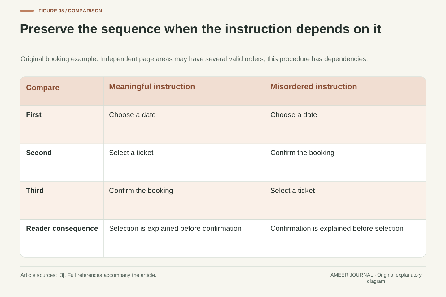
Suppose our invented guide explains a booking process with three steps: choose a date, select a ticket, then confirm the booking. A visual layout might put them in that order while the underlying content presents date, confirmation, ticket. Reading that sequence gives the instruction to confirm before the selection has been explained. In this example, the order carries meaning. Fixing a heading label alone would leave the broken sequence; the steps themselves need to be available in a sensible order. [3]
Now compare a museum address panel and a separate newsletter panel. Their relative order might not change either panel’s meaning. The standard does not demand a single universal position for all independent content. A useful review therefore follows connected instructions and paragraphs through their actual reading sequence, especially after layout changes. Keep each explanation together and preserve dependencies. This supports different screen sizes while giving the reader a coherent account of what to do next. [3]
WCAG 1.3.2 applies where presentation sequence affects meaning: a correct reading sequence must be programmatically determinable. Its explanation explicitly permits multiple correct orders where independent areas do not depend on one another. Consequently, visual order differing from programmatic order is an investigation prompt, not by itself a complete failure determination. Identify the dependency that would be lost, and inspect whether the available sequence preserves it. [3]
The original booking example has a dependency chain: choose date, select ticket, confirm booking. Suppose a CSS arrangement visually presents that chain but the authored reading sequence is choose date, confirm booking, select ticket. With no additional structure that preserves the intended instruction, the linear sequence misorders the procedure. The example concerns the order of explanatory steps, not a claim about a specific booking application’s focus management. Repair the meaningful sequence and then examine any separate interaction-order issue on its own evidence. [3]
An address panel and an independent newsletter panel provide a useful contrast within the same fictional page. Either may reasonably precede the other without changing meaning, provided their contents remain coherent. This prevents an overly rigid review that equates one desktop arrangement with the only permissible accessible order. For responsive design, inspect the actual content dependencies across states: paragraphs should remain intelligible, steps should retain their required order, and unrelated regions need not be forced into an arbitrary global ranking. [3]
Add meaning to the page without creating noise
It is tempting to repair an unclear page by adding more labels everywhere. That can create a new problem: a long collection of regions with nearly identical names. For the museum guide, the main content, site links and within-guide links have distinct jobs. A small paragraph about ticket collection does not need another landmark simply because it sits inside a border. WAI’s region guidance asks whether the area is important enough to be a navigation destination. [2]
A visible heading can also name an appropriate region when it is connected using the documented aria-labelledby mechanism. This lets the visible subject and the programmatic label stay related. Alternatively, aria-label can provide a region name where suitable. The choice should make the existing structure clearer, not create an unrelated hidden title that describes something different. Our example can use “In this guide” consistently for the contents links rather than maintaining several competing names for the same group. [2]
Finally, revisit the ordinary writing. A correct outline full of vague labels still makes navigation laborious, and a well-named region cannot untangle an instruction that appears before its explanation. Review names, nesting and sequence as one piece of editing. The best repair may be a clearer heading or a reordered paragraph, rather than another landmark. [1][2][3]
Landmark design is a selection problem, not a count-maximisation exercise. APG defines region for content sufficiently important to justify navigation to it and recommends roles that match each area’s purpose. For the fictional guide, main, site navigation and within-guide navigation offer meaningful distinctions. Giving every bordered ticket paragraph an identical named region would expand the inventory without creating comparably useful choices. That judgement follows the example’s information architecture rather than a universal numeric limit on landmarks. [2]
Where an appropriate region already begins with a visible heading, aria-labelledby can use that heading as the region’s accessible name. APG also documents aria-label for areas requiring a label without such a heading. These mechanisms associate a name; they do not by themselves prove the region boundary or heading rank is correct. Check that the named target actually contains the promised subject, and that repeated role instances are labelled according to their differing or identical purpose. [2]
This produces three separate review questions: is the region warranted, is its role appropriate, and is its name useful? Combine the answers with the heading outline and meaningful reading sequence. A new label cannot repair paragraphs that depend on an explanation encountered later, and a valid h3 does not explain an unrelated region name. Treat these as connected authoring decisions while preserving their distinct semantics. [1][2][3]
Keep a review record that another person can follow
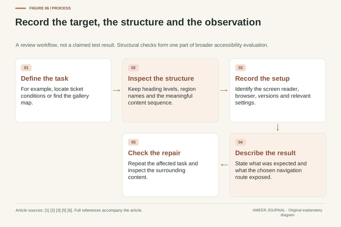
Start with the reader’s task, such as finding ticket conditions or reaching the gallery map. Write down the heading names and levels, the main page areas and their names, and the sequence of any connected instructions. Then examine the page using the relevant screen reader and browser. Record their versions and important settings. The documentation provides the available navigation methods, while the observations show what this particular page and setup actually expose. [1][2][3][5][6]
A useful finding names the target and the problem: “The gallery-map title looks like a section heading, but it is absent from this headings list,” or “The booking explanation reads confirmation before ticket selection.” These are hypothetical report examples, not results from a tested museum site. They point to evidence a reviewer can check and a repair another person can assess. Keep screenshots if useful, but also preserve the relevant structure and reading order; appearance alone cannot capture the whole issue. [1][3][5]
After a repair, repeat the affected task and check that nearby content still makes sense. A structural review is one part of broader accessibility work; it does not by itself establish that every control, image, dialog or journey is usable. Its particular value is concrete: readers get dependable ways to locate subjects, understand page areas and follow content in a meaningful sequence. Those capabilities can remain useful even when the visual design changes substantially between phone, tablet and desktop. [1][2][3]
A reproducible structural review begins with expected tasks and an authored-content inventory. Retain heading text and rank, landmark role and accessible name, relevant containment, and meaningful sequence. Add the exact browser, assistive-technology version, operating environment and material settings used for observation. The NVDA and Apple documentation identifies routes worth examining, but a documentation citation is not a substitute for recording the behaviour observed in the chosen combination. [1][2][3][5][6]
Express a finding as an expectation, observation and consequence. In the fictional example, the expected Gallery map heading might be missing from a headings inventory, preventing that direct route; alternatively, the booking explanation might expose confirmation before ticket selection. Neither result is claimed here as a performed test. These example reports show the level of detail that permits diagnosis and later verification without relying on an impression that the page feels confusing. Compare the same task after a repair and retain any changed conditions.
The boundary of this review remains structural navigation and content order. Correct headings and landmarks do not certify every interaction or establish complete accessibility conformance. They do establish a more precise foundation for further evaluation: topics have intelligible relationships, important areas have appropriate identities, and dependent content can be read coherently. Preserve those relationships across responsive layouts, and verify them through the tools actually used by readers instead of treating visual consistency as evidence that all navigation paths are equivalent. [1][2][3][5][6]
Sources & further reading
Explore the references behind this guide. External pages may change after our review.
- Headings | Web Accessibility Initiative (WAI) | W3CW3C WAI · Accessed 6 Nov 2026
- Landmark Regions | APG | WAI | W3CW3C WAI · Accessed 6 Nov 2026
- Understanding Success Criterion 1.3.2: Meaningful Sequence | WAI | W3CW3C WAI · Accessed 6 Nov 2026
- Understanding Success Criterion 2.4.4: Link Purpose (In Context) | WAI | W3CW3C WAI · Accessed 6 Nov 2026
- NVDA 2026.3 User GuideNV Access · Accessed 6 Nov 2026
- Intro to advanced navigation with VoiceOver on Mac - Apple SupportApple · Accessed 6 Nov 2026
Article updated 6 Nov 2026.
Found something we should revisit?
Good explanations get better with thoughtful feedback.