What you’ll take away
- Keyboard access concerns completing a task, not making every visible item a separate Tab stop.
- In manual tabs, arrow movement changes focus while Enter or Space changes selection and the displayed panel.
- A roving Tab entry, the current focus target and the selected item must be coordinated deliberately.
- Visible focus, logical order and protection from covering content require separate checks.
- Record the starting state, key, resulting states and exit route in the actual browser and input environment.
A selected panel and the current keyboard target can differ
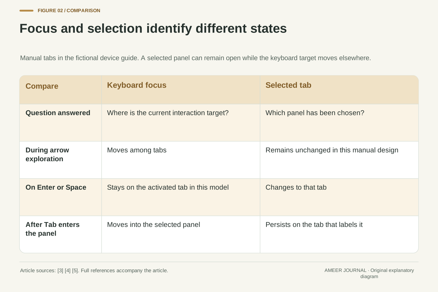
Imagine a device guide with three tabs: Overview, Ports and Power. Overview is currently displayed. You press an arrow key and a visible outline moves to Ports, but the Overview text remains on screen. That can be a deliberate interaction: focus has moved, while selection has not. In a manually activated tab interface, pressing Enter or Space confirms the focused tab and changes the displayed panel. W3C's ARIA Authoring Practices Guide, or APG, describes this separation [3][4].
Focus identifies the current point of keyboard interaction; selection identifies the chosen item in a component that supports that state [3][5]. Our fictional guide will use these two ideas throughout. It has a horizontal tab list, one displayed panel, and text at the start of each panel. All state traces and screen coordinates below are original paper examples, not observations of a tested product. Following one small interface makes it possible to ask precise questions: where did the key move focus, what became selected, and which content is now displayed?
Keyboard focus and application selection are separate state variables. HTML describes keyboard input being routed to the focused widget, while APG distinguishes that interaction target from a selected item whose state can persist after focus leaves [3][5]. In the tabs pattern, the selected tab identifies the displayed panel. Manual activation allows directional navigation to change focus without immediately changing selection [4]. A different appearance on two tabs need not mean two simultaneous DOM focus targets.
The original fixture is a horizontal device-guide tab list with Overview, Ports and Power. Exactly one panel is selected and displayed; each panel begins with ordinary text. The examples use one simple document and a roving-tabindex implementation, without nested browsing contexts or shadow trees. They describe expected state transitions, not completed browser or assistive-technology tests. Keeping focus, selected tab and visible panel distinct lets the same sequence expose navigation, activation and presentation errors without confusing one category of behavior with another.
Keyboard access is about completing the action
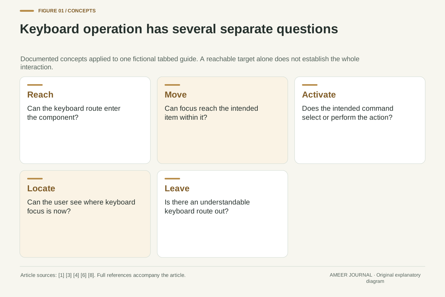
Counting the things reached by Tab is useful, but it does not settle whether a task works. A control might receive focus yet ignore the key intended to activate it. Conversely, a grouped interface can offer a keyboard route to its items without putting every item in the page's Tab sequence. WCAG 2.2's Keyboard criterion concerns operating functionality through a keyboard interface; its explanation does not require every visible pointer control to be a separate focusable keyboard target [1].
The requirement includes a specific exception for functions whose input depends on the movement path, and it avoids requiring particular timing for individual keystrokes. That exception belongs to the underlying function, not merely to an author's decision to implement it with a mouse [1]. For the guide, selecting a panel plainly has a keyboard route. Native HTML controls supply useful built-in behavior, whereas adding an ARIA role to a custom element does not create the necessary keyboard handling [3]. A familiar appearance and a descriptive role still need working interaction.
WCAG 2.2 SC 2.1.1 evaluates functionality operable through a keyboard interface without specific timings for individual keystrokes, with its stated exception for an inherently path-dependent function [1]. This is an outcome requirement, not a universal rule that every pointer-visible element must independently participate in sequential focus navigation. The Understanding document explicitly distinguishes preferred platform conventions from the narrower normative criterion. Meeting that one criterion also does not establish complete accessibility conformance.
For a custom component, semantics and behavior are separate obligations. APG explains that browsers do not automatically implement a widget's keyboard interface merely because ARIA roles and states describe it [3]. The author must provide the appropriate navigation and activation behavior, or use suitable native controls that already supply it. In our guide, an element exposing the tab role must participate in a coherent tab interaction. Demonstrating that it can receive focus establishes reachability only; the activation and panel-state transitions still need their own evidence.
Tab moves between components; arrows can move inside one
APG describes a common distinction: Tab and Shift+Tab move between interface components, while other keys move among items within a component [3]. In its tabs pattern, entering the tab list places focus on the active tab. Left and Right move among tabs in a horizontal list, wrapping at the ends. Tab then leaves the list for the next appropriate focus target outside it [4]. Three tabs therefore need not create three consecutive stops in the page's Tab sequence.
For our guide, pressing Right from Power returns focus to Overview. Pressing Tab instead moves out toward the displayed panel. Because that panel begins with text, the documented pattern includes the panel itself in the sequence; an appropriate first focusable content element can change that destination in another design [4]. These are tabs inside a page, not browser-tab switching commands. Nor should the pattern be copied indiscriminately onto ordinary navigation links. The component's meaning determines which keyboard convention helps the reader predict the next move.
Sequential navigation and composite-internal navigation serve different scopes. APG recommends one sequential entry within a composite, with internal movement implemented through its appropriate keys [3]. For a horizontal tablist, Left/Right move focus to the previous/next tab with wrapping. Tab enters at the active tab and leaves for the next target outside the tablist [4]. This division reduces repeated sequential stops without making the other tabs unreachable.
The fixture's panels begin with non-focusable text, so its tabpanel has tabindex zero as described by the pattern [4]. That detail is part of the model: if the first meaningful content were already focusable, the exit target could differ. A horizontal tablist also leaves Up/Down available for ordinary browser scrolling under the documented convention. The model does not impose one arrow map on every component, replace browser navigation commands, or treat a collection of unrelated links as a composite merely because the links appear in a row.
Follow focus and selection through the same key sequence
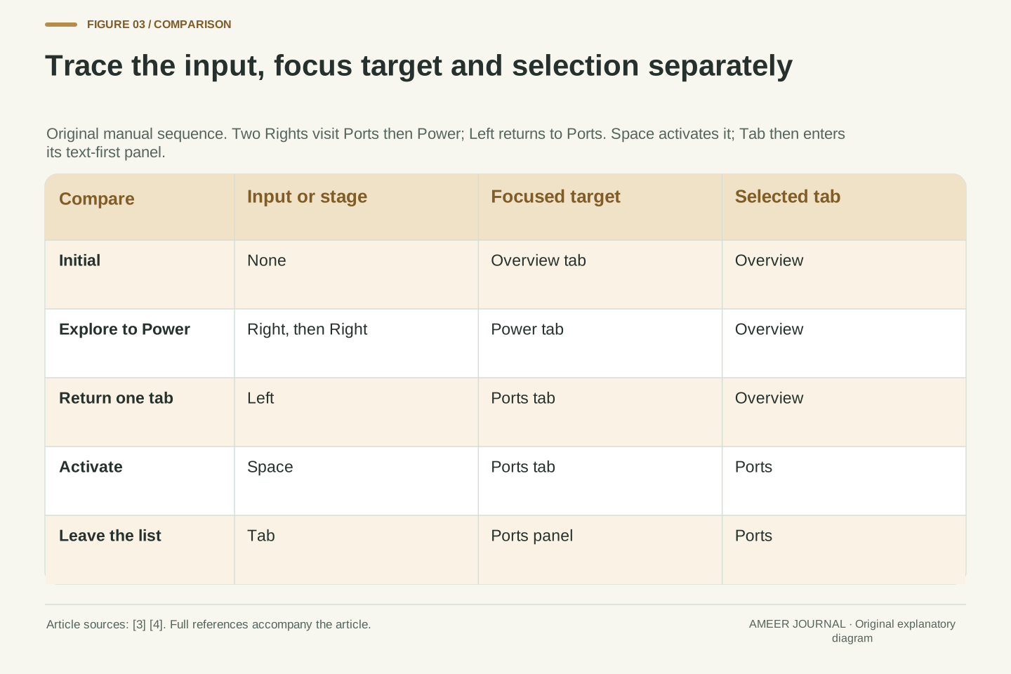
Start with focus on Overview and Overview selected. Right moves focus to Ports; a second Right moves it to Power. Overview remains selected because this version uses manual activation. Left then returns focus to Ports, still without changing the displayed panel. Only when Space is pressed does Ports become selected and its content replace Overview. This original sequence follows the documented navigation and manual-activation rules [3][4].
Now press Tab. Focus moves into the displayed Ports panel, while Ports retains its selected appearance. That persistent mark answers which panel is open, not where the next keyboard input is directed. A useful check records both answers after each step. If the content changes on the first Right, the implementation has automatic behavior rather than the manual behavior specified here. If Space changes a label but leaves Overview visible, the state and content have become inconsistent. These are hypothetical findings that a real review could investigate, not faults observed on an actual site.
Number the tabs Overview=0, Ports=1 and Power=2. Let f identify the focused tab while focus is inside the list, and s identify selection. In the stipulated manual model, Right applies f=(f+1) mod 3, Left applies f=(f−1) mod 3, and either operation leaves s unchanged. Starting at (f,s)=(0,0), Right, Right, Left produces (1,0), (2,0), (1,0). Space then assigns s=f, giving (1,1) and displaying the Ports panel [3][4].
Tab moves focus outside the list to that panel in this fixture. It does not reset s: Ports stays selected. The complete trace therefore needs a general focus-target field, not just a tab index, once navigation leaves the component. Three assertions can be checked separately: the target follows the requested navigation, selection changes only on the specified activation, and the displayed panel corresponds to selection. An implementation may satisfy one while failing another. The trace defines those expectations without reporting any unperformed compatibility test.
One Tab entry can move without disabling the other tabs
One implementation uses what APG calls roving tabindex. Of the tab elements, one has tabindex zero and the others have minus one. Directional movement changes which tab has zero and explicitly moves focus there [3]. Minus one does not mean that a tab is disabled, hidden or unusable. It removes the ordinary sequential entry preference while allowing a suitable focus action to reach it. HTML documents platform and user-agent qualifications around those preferences [5].
There is a further detail when focus leaves. Suppose you explore as far as Power but do not activate it, so Overview remains selected. The tab pattern expects the active tab to be the entry target next time [4]. This implementation therefore restores the zero entry to Overview on exit, using APG's documented provision for choosing the next entry target [3]. Simply remembering the last arrow destination would give a different result. The selected panel, the currently focused tab and the tab prepared for later entry need deliberate coordination.
For the tab elements alone, the roving strategy maintains one tabindex=0 and assigns −1 to the others. On an internal navigation event it demotes the old entry, promotes the destination and invokes focus on that destination [3]. The numerical attribute is not itself the focus-moving operation. Nor is a negative tabindex a disabled or inert state: HTML distinguishes those conditions and permits user-agent preferences to affect sequential or click focusability [5].
The fixture uses the selected-tab entry convention. If f=2 while s=0 and the user leaves without activation, the next-entry index is restored to 0; selection and the visible panel remain Overview. APG explicitly describes adjusting the entry target when a composite loses focus if its design requires a particular return point [3][4]. Associated panel focusability is separate from the one-entry invariant among the tabs. Other composite implementations can use different suitable strategies, so this account is a worked implementation choice rather than a claim that every valid widget uses identical attributes.
Choose when movement should also select content
Automatic activation is another documented tabs design. Moving focus to a tab also selects it and shows its panel. APG recommends that approach when panels can appear without noticeable delay; it warns that waiting for content on each movement can make navigation difficult [4]. The choice affects the experience of exploring labels before settling on a destination. It is not decided by whether the tab labels look attractive or whether a mouse click works.
Consider a separate, deliberately simple event count. Our imaginary application runs one selection-update handler each time the selected tab changes. Starting at Overview, two Rights change selection twice in the automatic version. The manual version changes it zero times during those arrows, then once when Enter activates Power. This counts specified application events, not network requests or measured seconds. Caching, preloading and the implementation can change the cost of an event. The comparison identifies what is coupled to movement before anyone makes a claim about speed.
Automatic activation couples the directional focus transition to selection: after each valid move, s becomes f. Manual activation keeps the two transitions separate. APG's tabs guidance recommends automatic activation when the associated panel can be displayed without noticeable latency, typically with content already loaded [4]. It supplies no universal millisecond threshold here. The recommendation is about preserving efficient navigation, not an unconditional requirement to make every focus change perform application work.
In the separate handler-count model, assume exactly one handler invocation per actual selected-tab change. From Overview, Right then Right yields two selection changes in automatic mode. Manual mode yields none until Enter produces one change to Power. These counts follow from the stated transition rules. They are not timings, request counts or evidence about a browser's scheduling. A design review can use the distinction to ask what expensive work is attached to selection and whether navigation remains responsive, while measurements of any real performance need their own setup and observations.
A numbered Tab order does not repair a confusing page
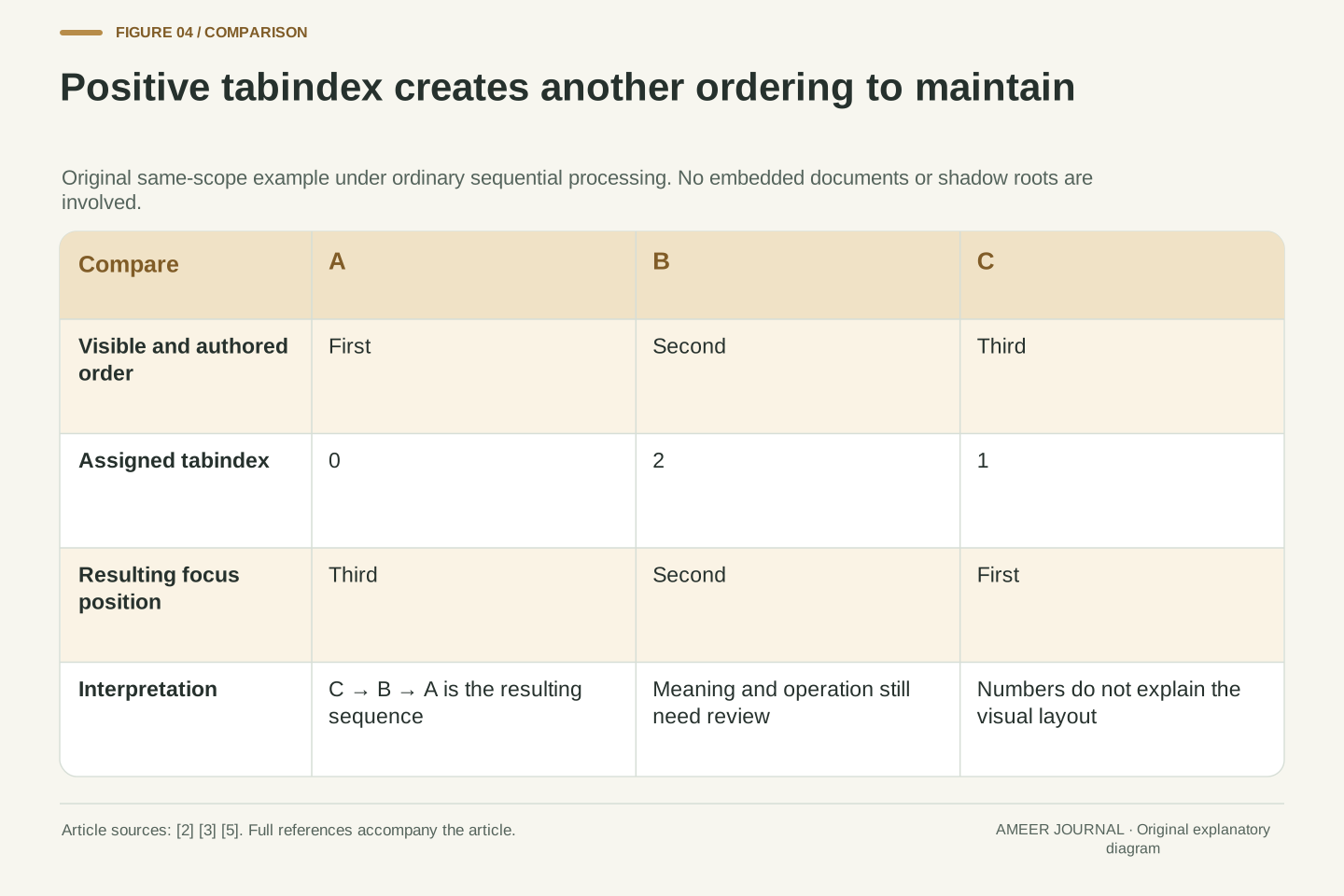
Adding positive tabindex numbers can change sequential order, but that makes another ordering system to maintain. APG discourages using those values to rearrange the sequence, and HTML cautions that values other than zero and minus one are difficult to use correctly [3][5]. In a simple fictional group appearing as A, B, C, give A zero, B two and C one. Under the ordinary same-scope ordering, focus goes C, B, A. The displayed position has not explained that surprising route.
WCAG's Focus Order criterion asks whether the sequence preserves meaning and operation where order matters [2]. It does not require a single visual arrangement in every case, and it does not automatically forbid focus on static content. Independent sections can have more than one sensible order. The relevant question is what the user needs to understand and do next. Fixing the underlying grouping and sequence is usually clearer than assigning numbers to force one desktop layout, especially when a responsive layout later changes where those groups appear.
Positive tabindex values introduce relative ordering within a focus navigation scope. APG explains their priority ahead of ordinary zero/default sequential entries and strongly discourages their use for ordering; HTML's developer guidance also cautions about values beyond zero and −1 [3][5]. For the isolated, ordinary same-scope example A:0, B:2, C:1, the resulting sequence is C, B, A. This is not a global ordering claim across shadow roots or embedded documents.
WCAG 2.4.3 applies when sequential navigation affects meaning or operation. Its target is a coherent, operable order, and its explanation allows more than one valid ordering and appropriate static focus targets [2]. A visual/programmatic mismatch is therefore a reason to investigate, not a complete failure diagnosis by itself. Identify the dependency or grouping that is broken. Restoring an intelligible authored sequence avoids maintaining a second fragile numeric ordering that may diverge as controls are inserted, removed or repositioned across layouts.
Show where input will go, not only what remains selected
After focus enters the Ports panel, the Ports tab can remain visibly selected. If that is the only mark on the page, it does not tell a sighted keyboard user where focus went. APG says focus and selection should look distinct, and WCAG's Focus Visible criterion requires a mode of keyboard operation with a visible focus indicator [3][6]. The two visual signals can coexist because they report different information.
Removing an outline without providing another adequate indicator loses that location cue. HTML's guidance explicitly warns against using focus-management methods to hide an unwanted focus ring [5]. A screenshot of a selected tab alone cannot demonstrate the whole interaction. Follow the indicator as the user moves through the list, activates Ports, and enters its content. Other requirements can apply to the indicator's contrast and appearance [6], so merely drawing a border is not a complete assessment. Its practical job is to make the next point of interaction discoverable.
Selection styling and keyboard-focus indication must represent their respective states. In the fixture, s=Ports persists while the active target becomes its panel. Styling only the selected tab leaves the focused panel unidentified. APG calls for a distinction between the two states, while WCAG 2.4.7 addresses visible keyboard focus [3][6]. The criterion's mode-of-operation language accounts for user agents that reveal the indicator specifically during keyboard interaction.
HTML warns against removing focus merely to suppress its ring and recommends an alternative focusing style when overriding the default [5]. A state inspection and a visual inspection therefore answer complementary questions: the active target may be correct while its visible indication is absent. Focus Visible does not itself supply every size or contrast threshold; the retained guidance identifies related criteria [6]. Preserve the active target, selected state and indicator observation separately in a review record instead of treating a screenshot with one highlighted tab as proof that all three agree.
A correctly focused control can still sit behind an overlay
Visibility also depends on what covers the control. WCAG 2.2's Focus Not Obscured Minimum criterion addresses a focused component being entirely hidden by content created by the page author [7]. That is different from asking whether a focus outline exists. Its minimum condition allows partial obscuring; the stronger Enhanced criterion addresses any part being hidden. Neither distinction makes a partly covered control the preferred design.
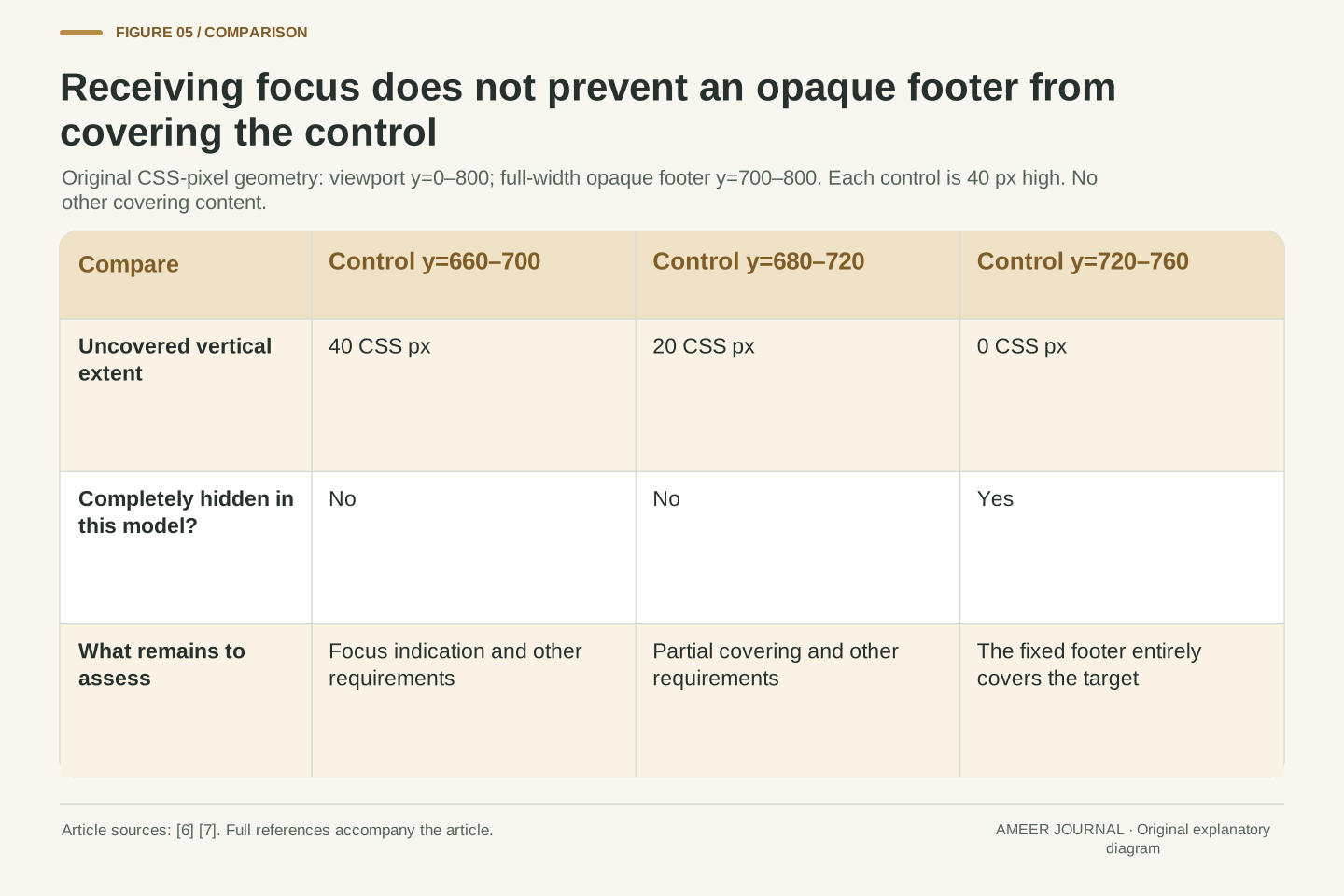
Use an original flat-screen model measured in CSS pixels. The viewport runs from vertical position 0 to 800, and an opaque, full-width fixed footer covers 700 to 800. A 40-pixel-high control at 720–760 is completely covered. At 680–720, twenty pixels remain uncovered; at 660–700, all forty do. Those results describe only this simple overlap. The minimum criterion has separate notes for user-movable and user-opened content, which our fixed author-created footer is not [7]. Partial exposure here does not establish that the indicator, text or entire page is usable.
WCAG 2.4.11 Minimum evaluates the component receiving focus, not an external focus indicator as a separate object. It prohibits complete hiding by author-created content, subject to its notes about user-movable and user-opened content [7]. Its AA minimum is distinct from the Enhanced no-part-hidden condition. An outline might be obscured while part of the component remains exposed, so Focus Visible needs separate consideration [6][7].
In the stipulated geometry, y increases downward, viewport height is 800 CSS px, and an opaque footer occupies the full width for 700≤y≤800. A control of height 40 px has uncovered vertical extent 40, 20 or 0 px at intervals [660,700], [680,720] or [720,760], respectively. With no other covering content, these are simple interval intersections with the uncovered viewport. They establish whether this rectangle is wholly covered, not a complete conformance verdict. No zoom behavior, browser rendering, focus-indicator geometry or actual device measurement is inferred.
Keep a meaningful destination when the focused item disappears
Focus management becomes especially important when an action removes the current target. APG describes the need to keep focus visible and logical after closing or deleting content [3]. A program cannot keep directing interaction to an item that no longer exists and expect the user to understand what happened. The next destination should follow the operation and the surrounding task, rather than jumping to an unrelated place simply because it is convenient to select in code.
Consider a separate version of our guide that allows tabs to be deleted. If Power is both focused and selected and is the final tab in the row, this version deliberately moves to and activates Ports when Power is removed. That matches the preceding-tab fallback described in APG's optional deletion pattern [4]. If every tab can be removed, the interface needs a logical destination outside the empty list. Deletion is optional, so this is not a demand that every tabbed guide provide it. It shows why changing the available items also changes the focus-management problem.
Removing or hiding the active target changes the focus graph. APG advises managing those changes so that focus remains visible and its destination is logical [3]. The relevant operation is not just updating a selected identifier or deleting a node. The implementation must also establish an appropriate surviving interaction target, using the focus behavior applicable to the component [5].
For a separate deletable-tab variant, stipulate f=s=Power and Power as the last item in [Overview, Ports, Power]. Removing it leaves [Overview, Ports]; this design chooses f=s=Ports and displays that panel. APG's optional Delete behavior describes following-tab focus, falling back to the preceding tab when there is no following item, and a logical external destination if all tabs disappear [4]. Our activation choice is explicit rather than a claim that every deletion automatically selects. The surviving-target invariant can be checked separately from whether the content removal itself succeeded.
A contained interaction still needs a keyboard way out
Reaching and using a component are incomplete if you cannot leave it. WCAG's No Keyboard Trap criterion requires a keyboard route away from a component entered by keyboard, with instructions when an unusual exit method is needed [8]. It does not say every component must leave on the same key. Escape is common in many environments, but the guidance does not define it as a universal answer for every control.
Our tab list leaves through Tab, entering the displayed panel. A separate modal dialog can intentionally keep ordinary navigation inside while it is open, provided the user has an understandable keyboard way to dismiss it [8]. In a fictional two-button dialog, activating a keyboard-reachable Close button can end that contained interaction. The review question is whether a usable exit exists, not whether all focus containment is automatically wrong. Avoid swallowing unrelated keys: the documented horizontal tabs pattern, for example, leaves Up and Down available for scrolling [4]. An escape route and predictable ordinary navigation solve related but distinct problems.
WCAG 2.1.2 requires focus to be movable away using a keyboard interface when it can be moved into the component that way. If departure requires more than unmodified arrow or Tab keys or another standard exit method, the method must be communicated [8]. The explanation recognizes platform-dependent exit conventions and appropriate modal containment. It does not impose a universal Escape handler or prohibit every bounded Tab cycle.
The fixture's normal Tab exit provides a simple case. A separate modal can keep sequential navigation among its controls while exposing a keyboard-operable dismissal. Its containment must not be confused with an inescapable widget. After dismissal, a logical focus destination is still necessary, connecting exit behavior with the preceding focus-persistence discussion [3][8]. Review key handling at the component boundary: consume the commands the pattern needs and preserve unrelated behavior. APG's horizontal tabs specifically leave vertical arrows for browser scrolling [4]. A working internal arrow loop alone proves neither exit access nor sensible command routing.
Record the task and the state after each key
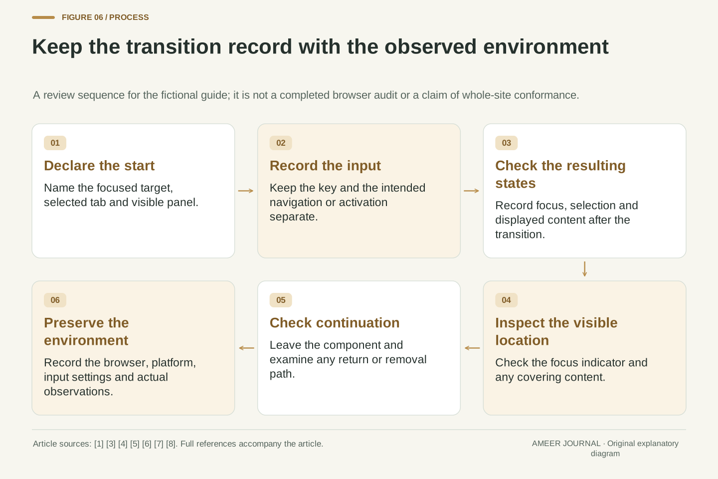
A useful review begins with a short task: enter the guide, explore Power without selecting it, activate Ports, read its panel, and continue beyond the component. Record the starting selection and target, each key, the resulting target, the selected tab and the displayed panel. Then note whether the focus indicator is visible and whether an overlay covers the control [3][4][6][7]. This makes the observation much more useful than a statement that Tab seems to work.
Keep the browser, operating environment, keyboard settings and any assistive technology with a real observation, because focus preferences and command routing can vary [1][5]. Our trace is an expectation derived from a stated design; it is not a substitute for testing that design. Check the exit and any removal or return path as well [8]. The central lesson is practical: reaching a control, moving within a group, choosing an action and seeing the target are separate parts of successful keyboard use. Giving each part an explicit expectation makes problems easier to locate and repairs easier to verify.
Represent a review step as initial state, input, expected focus target, expected selection, visible panel and observed presentation. For this fixture the manual state trace, roving-entry invariant and external Tab exit supply concrete assertions [3][4]. Visibility and overlap then add separate observations, while removal and dismissal add state-dependent transitions. A DOM target alone cannot establish that a reader can see it or understand the next action [6][7][8].
Actual observations need their browser, platform and relevant input configuration; HTML permits user-agent preferences around focusability, and WCAG distinguishes conventions from the underlying functionality requirement [1][5]. The paper models establish neither real compatibility nor complete WCAG conformance. They provide a precise review vocabulary: sequential entry, internal navigation, explicit activation, persistent selection, visible focus and a known exit. Preserve those distinctions when a layout or component changes, and compare the affected transitions again instead of relying on an unchanged screenshot or the number of controls reachable with Tab.
Sources & further reading
Explore the references behind this guide. External pages may change after our review.
- Understanding Success Criterion 2.1.1: Keyboard | WAI | W3CW3C · Accessed 7 Nov 2026
- Understanding Success Criterion 2.4.3: Focus Order | WAI | W3CW3C · Accessed 7 Nov 2026
- Developing a Keyboard Interface | APG | WAI | W3CW3C · Accessed 7 Nov 2026
- Tabs Pattern | APG | WAI | W3CW3C · Accessed 7 Nov 2026
- HTML Standard, Edition for Web DevelopersWHATWG · Accessed 7 Nov 2026
- Understanding Success Criterion 2.4.7: Focus Visible | WAI | W3CW3C · Accessed 7 Nov 2026
- Understanding Success Criterion 2.4.11: Focus Not Obscured (Minimum) | WAI | W3CW3C · Accessed 7 Nov 2026
- Understanding Success Criterion 2.1.2: No Keyboard Trap | WAI | W3CW3C · Accessed 7 Nov 2026
Article updated 7 Nov 2026.
Found something we should revisit?
Good explanations get better with thoughtful feedback.