What you’ll take away
- Review an image alternative in its actual page placement, including its function and the words already present.
- An image-only link needs its destination conveyed; a redundant image beside text in the same link can need an intentionally empty alternative.
- An explicitly empty alt attribute and an absent or unreviewed alternative are different decisions.
- A chart’s short summary should work with the full values and a usable longer description, without inventing trends or causes.
- A layout, destination or data change can invalidate a previous text-alternative decision even when the image file is unchanged.
A true description can still leave the reader without the needed answer
Imagine an image described as a folder outline with a raised tab at the upper left. That could be a perfectly accurate description of its shape. But if the image is the only visible content of a link, the reader still needs to know where selecting it will lead. Describing the drawing and explaining the link are different jobs.
This distinction matters when using AI to help write alternative text, often called alt text. Microsoft documents automatic alt-text generation alongside a workflow for reviewing and editing the result [4]. A fluent proposal is a starting point for that review. Its words need to be checked against the image’s use, not only against the objects visible in the file.
Our examples use one invented folder drawing in three placements and a small fictional chart. The candidate descriptions are written for this explanation, not collected from an AI benchmark. We will ask which information a reader needs in each placement, which information is already present, and how to preserve important details without turning every image into a long spoken inventory.
Visual description accuracy and suitability as a text alternative are separate properties. A caption can correctly identify the shapes in an image while failing to convey the destination of an image-only link. Conversely, repeating that caption where the image adds no information may introduce redundancy without making the interaction more understandable.
Microsoft’s documented alt-text workflow includes automatic generation and subsequent review or editing [4]. This article examines the editorial decision that remains after a candidate string exists. It does not measure the quality of that generator or assume that every AI tool receives only an isolated image. The relevant evaluation unit is the image in its actual content and interaction context.
The original fixtures specify a shared asset, three different placements and a separate four-value chart. Their candidate descriptions are deliberately authored examples. No browser accessibility tree, screen reader or user study is reported. The analysis concerns whether the proposed information matches the stipulated purpose and preserves the data needed by a reader. Actual platform behavior and complete accessibility conformance require additional evaluation beyond these text-alternative examples.
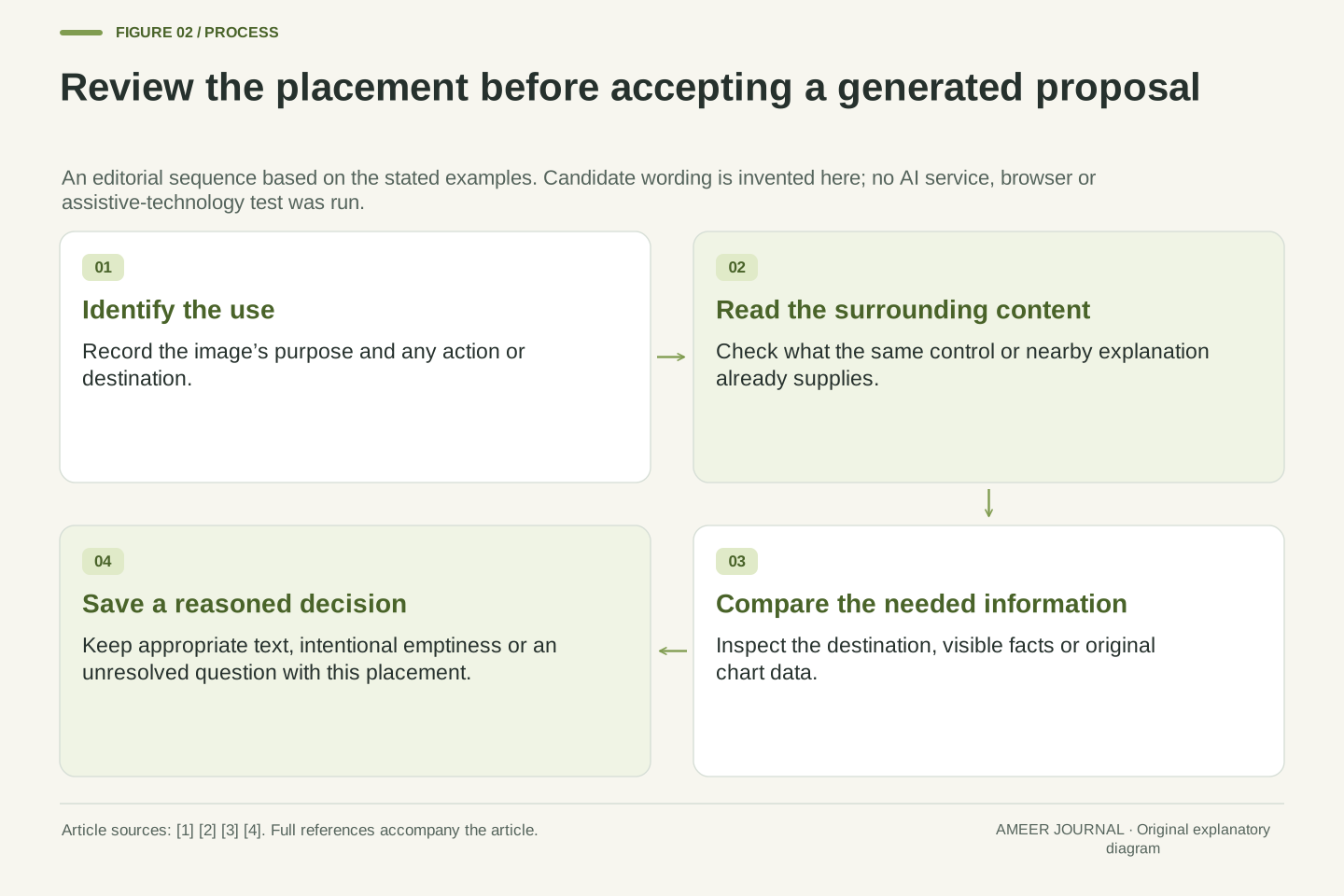
Keep the image file separate from each place it appears
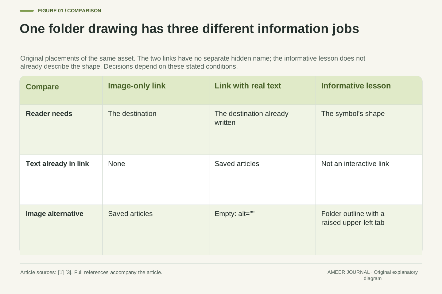
Call our invented drawing folder-outline-01. In the first placement, it is the only content of a link that opens a page of saved articles. The link has no other supplied name. In the second, the same drawing sits inside a link beside real text reading Saved articles. The drawing adds no information beyond that text. In the third, it appears in a lesson about recognizing interface symbols, where the folder’s shape is the information being taught.
The pixels are unchanged across the three placements, but the reader’s question changes. Where does this link go? Does this picture add anything to the words already in the link? What does the symbol look like? W3C’s image tutorials make purpose and surrounding content central to choosing alternatives [1][3].
A single description stored against the file cannot automatically settle all three uses. It might be useful in the lesson and unhelpful in navigation. Keep an image’s identity for reuse, but review the alternative at the place where readers encounter it. That is where the file acquires a job.
Separate asset identity from placement identity. Let one image asset appear as P1, the sole content of a native link to the saved-articles page; P2, a redundant image within a link also containing the visible text Saved articles; and P3, a noninteractive illustration whose intended information is the folder symbol’s shape. Assume no other accessible-name mechanism in P1 or P2.
These placements share an asset but differ in the information required of its alternative. P1 needs a destination; P2 already provides that destination through the same link’s real text; P3 needs a description of the visual form. The WAI functional and decorative examples support making the decision at this contextual level [1][3]. The fixture does not claim that these exhaust all possible naming arrangements.
An asset-level default can therefore be a candidate rather than a final decision. A content model should preserve the placement’s purpose, associated control or surrounding information and any reviewed alternative. Reusing the image bytes is safe only with respect to those bytes; it does not establish that the same text has the same role in every resulting page.
For the image-only link, communicate the destination
In the first placement, choose Saved articles as the image’s alternative. It tells the reader where the link leads. A folder outline with a raised tab tells them what is drawn, but leaves the link’s actual purpose uncertain. The same familiar folder shape could be used for many different destinations; its appearance alone does not identify our saved-articles page.
WAI’s functional-image guidance focuses on the action or destination represented by an interactive image [1]. Our example applies that idea to a new, explicitly defined link. It does not suggest that every folder drawing should always be named Saved articles. That wording is correct because this particular link has that destination.
Keep the wording aligned with the real destination when the product changes. If the link later opens a download library, the old alternative becomes misleading even though the icon still looks accurate. The useful review question is whether the label helps someone choose the intended action before following it. Recognizing the picture is only one part of that decision.
For P1, the image is the sole content of a native link and no independent name has been supplied. An image alternative conveying Saved articles provides the destination information required by this fixture. Replacing it with a shape-only caption changes the information exposed by the image without explaining the navigation purpose.
This follows the functional-image distinction in WAI [1]. It is scoped to an image’s role inside the defined control, not a universal rule that any visible icon must carry the same label in every implementation. Other accessible-name mechanisms and richer programmatic context can change the analysis; they are deliberately absent from P1 so the contribution of the image alternative remains clear.
A content review should compare the label with the actual target rather than infer the target from the artwork. If the target changes while the asset and alternative remain unchanged, visual-description accuracy can remain high while destination accuracy becomes wrong. The defect is a mismatch between authored meaning and behavior. A better image-recognition result would not, by itself, correct a stale destination stored elsewhere in the page.
When the same link already says it, avoid repeating it
The second placement includes both the drawing and real text reading Saved articles inside the same link. In this fixture the drawing is only a visual cue. It contributes no extra status, file type or destination. An empty image alternative is appropriate because the link’s text already carries the needed meaning [1][3]. The link itself still has words.
This is different from putting an unrelated heading somewhere near an otherwise unnamed image-only link. Our example deliberately places the useful text within the same link. It is also different from an icon that adds a warning or identifies a file format missing from the words. An image that contributes extra information needs that contribution considered, rather than being hidden merely because some text is present.
For an AI-assisted workflow, provide that distinction to the reviewer or generator. The image file alone does not tell whether a label appears beside it within the control. A proposal that repeats Saved articles unnecessarily can be corrected by checking the completed placement. The objective is to preserve the link’s meaning while avoiding a second, redundant description of its decoration.
For P2, stipulate that the anchor contains the actual text Saved articles and that the image adds no independent information. An empty alt value on the image leaves the destination supplied by that text. WAI demonstrates the corresponding distinction between an image used alone in a link and a redundant image accompanying the link’s text [1][3].
The containment condition matters. We have not assumed that arbitrary visually adjacent prose automatically names a separate control. Nor does the presence of text justify discarding a nonredundant icon, such as one conveying an additional file format or another meaningful property. The author must identify the information contribution before deciding that it is redundant.
Our fixture concerns editorial content and a simple native structure, not a prediction of every assistive technology’s exact spoken output. The practical invariant is that the link retains its destination information after the image contribution is removed. A review that checks only whether the asset has a nonempty description would miss this contextual distinction and could reward unnecessary repetition instead of an appropriate alternative.
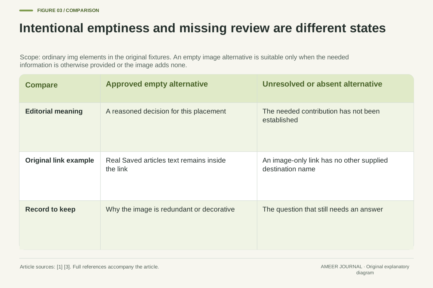
An intentionally empty alternative is different from a missing decision
For an ordinary HTML image, alt="" explicitly supplies an empty alternative. Leaving the alt attribute out is a different choice. WAI’s decorative-image guidance explains that a missing alternative can lead some screen readers to announce the filename [3]. The exact experience depends on the system, so a filename announcement should not be invented as a test result when no test has been run.
In our second placement, the empty value records a considered decision: the image adds nothing beyond the link’s real text. In the first placement, copying that same empty value would remove the only stated destination information in the fixture. Empty is therefore neither always correct nor always an error. Its meaning depends on what the surrounding control and content already provide.
A useful content workflow distinguishes these states. An alternative can be reviewed and intentionally empty, reviewed and descriptive, or still undecided. Treating all empty fields as the same state can either reintroduce decoration that was deliberately silenced or overlook an image whose purpose has never been assessed. Save the reason for the decision where the editor can find it.
Within the tutorial’s img-element scope, an explicitly empty alt attribute and an absent alt attribute are not interchangeable authoring states [3]. The former can express the deliberate treatment of a redundant or decorative image; omission does not document that decision and can produce filename-related fallback behavior in some screen-reader situations.
The original placements demonstrate why a blanket nonempty-string requirement is insufficient. P2 has a meaningful link name in its real text and an intentionally redundant image. P1 has no other stipulated naming source, so deleting the image’s destination alternative creates a different condition. The analysis is conditional on those supplied structures and is not a general recommendation to remove names from interactive content.
Represent review status independently from the string value. For example, a placement record can distinguish unresolved, approved-empty and approved-text, with the purpose and surrounding content retained. Those are editorial states, not new HTML attributes or a complete accessible-name algorithm. Their value is preserving why a particular empty value was chosen so that a later importer, AI assistant or editor does not silently reinterpret it as missing work.
The same drawing can need a visual description in a lesson
The third placement is a noninteractive lesson about recognizing interface symbols. Here the shape is the point. A folder outline with a raised tab at the upper left conveys information that our stipulated surrounding text does not already provide. Replacing it with Saved articles would introduce a destination that the illustration does not have.
This illustrates WAI’s distinction between an image included for information and one included only for decoration [3]. There is no contradiction in describing the drawing in one place and leaving its alternative empty in another. The decisions concern the image’s job in those pages. They are not competing judgments about whether the file is valuable or attractive.
Stay within the evidence while describing that shape. The invented drawing does not reveal a software brand, a person’s intention or the location of a file on someone’s computer. Adding those details would make the description more elaborate without making it more accurate. The right amount of detail is the amount that preserves the intended information for this lesson, with unnecessary assumptions left out.
For P3, the image is informational and noninteractive. The fixture specifically makes its visual shape the intended content and excludes a surrounding textual equivalent. The candidate description of the folder outline and raised upper-left tab is therefore relevant, whereas the destination label from P1 would misdescribe this use.
WAI states that the author’s purpose determines whether an image is informative or decorative [3]. Our three placements turn that contextual judgment into a concrete comparison: same asset, different required contribution, different appropriate alternative. This does not prescribe a unique sentence for every informational image. Several concise descriptions could preserve the same relevant facts.
The reviewer should separate visible evidence, supplied context and unsupported inference. In this case the folder outline supports a shape description, while an asserted operating system, ownership or actual stored-file state would require information the fixture does not contain. An AI proposal can be revised on those grounds without claiming that all generated descriptions fail. The assessment is whether this candidate communicates the intended facts in this particular placement.
A chart description needs more than the names of its shapes
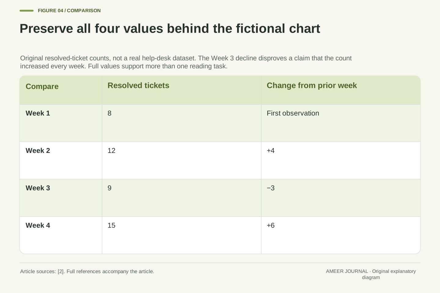
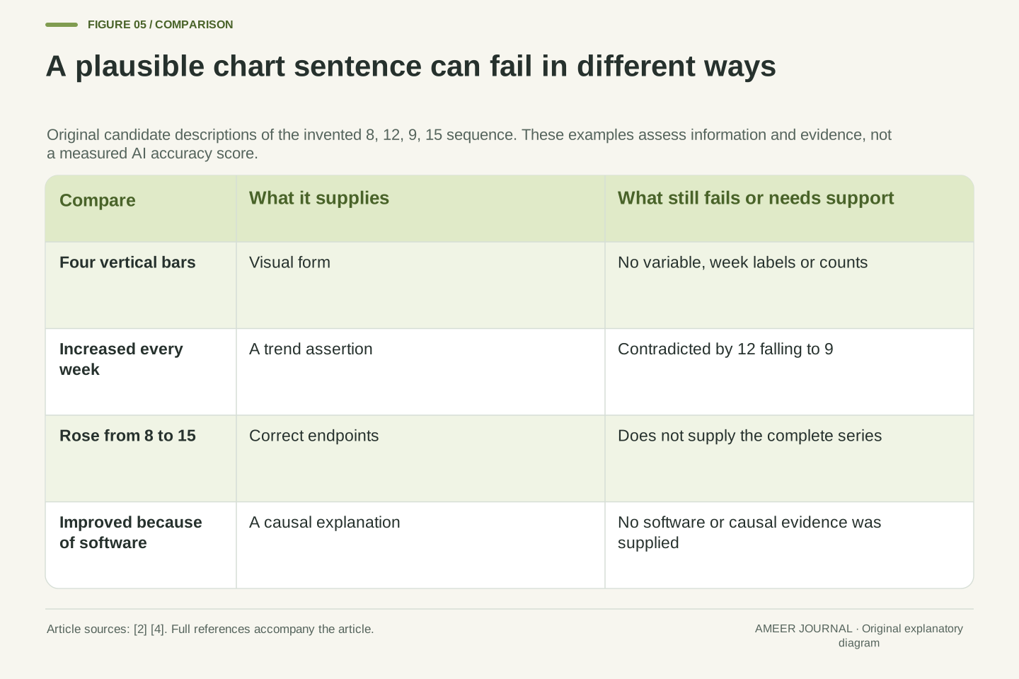
Consider a second invented image: a chart of resolved support tickets over four fictional weeks. Its values are 8, 12, 9 and 15. A description saying Four vertical bars identifies the visual form but supplies none of the variable, time labels or counts. Someone using that text alone cannot tell what the chart says.
A more ambitious candidate says Resolved tickets increased every week. It sounds useful, but it is false for these numbers: the count falls from 12 in Week 2 to 9 in Week 3. Another candidate blames or credits new software for the final increase. The chart contains no information about software or causes. These are original candidate sentences, not observed mistakes from a named AI system.
WAI’s complex-image guidance asks for the essential information represented by a detailed graphic [2]. In this fixture, that includes the counts and their relationships. Reviewing the alternative therefore requires looking at the underlying values. A polished sentence about progress is not enough if it changes the actual pattern or adds an explanation the data cannot establish.
Define a fictional four-week series y=(8,12,9,15), measured in resolved tickets per week. A form-only candidate such as Four vertical bars does not identify the measured quantity or expose the values. A monotonic-growth candidate is contradicted by the consecutive differences (4,−3,6), while a software-causality candidate adds an unsupported variable.
This separates three review dimensions: identification of the visual object, faithful communication of the represented data and preservation of the evidence’s limits. The original examples vary those dimensions independently. They are not a benchmark sample, a hallucination-rate estimate or a record of outputs produced by an external generator.
WAI’s complex-image tutorial provides the relevant basis for conveying essential information through a text equivalent [2]. Our finite series supplies the actual facts to verify. There are four labeled observations, a decline between the middle two, and a higher final value than initial value. No treatment assignment, staffing change, software introduction or causal comparison has been defined. A description should not manufacture those missing conditions while turning the chart into prose.
A short summary and the complete values serve different reading tasks
A supported summary is: resolved tickets rise from 8 in Week 1 to 15 in Week 4, with a fall to 9 in Week 3. That preserves an important overall pattern and the interruption. But it still leaves out the exact Week 2 value. A reader trying to compare the two middle weeks needs more than that short summary.
Provide the full record as real text or a properly structured table: Week 1, 8 tickets; Week 2, 12; Week 3, 9; Week 4, 15. The highest count is 15 in Week 4. The overall endpoint increase is 7 tickets, while the middle decline is 3 tickets. The original total across the four weeks is 44. Those answers can now be checked without estimating bar heights.
The short alternative can identify the chart and point clearly to the accompanying values and explanation. WAI describes combining a short identification with a fuller text equivalent for complex images [2]. The two parts work together. A concise summary helps orientation; the complete description preserves the detail needed for a different question.
A valid trend summary does not necessarily provide a complete data equivalent. The candidate identifying the rise from 8 to 15 and the Week 3 value 9 omits y2=12. The original data table preserves that missing observation as well as units and week labels, allowing queries beyond the author’s chosen narrative emphasis.
From the four supplied observations, Σy=44, the endpoint difference is 7 and the Week 2-to-Week 3 change is −3. The proportional endpoint increase is 7/8=87.5%, while the intermediate decrease is 3/12=25%. These ratios have different baselines and are not substitutes for the complete series. A statement that counts increased by 87.5% does not reveal the intervening dip or justify a causal explanation.
The two-part description pattern in WAI separates a short identification from the essential detailed information [2]. In our implementation concept, the short alternative explicitly locates the visible full values and trend explanation below the chart. That location must remain true in the delivered page. The chart, its summary and its table should derive from the same version of the data so that a later update does not leave mutually inconsistent alternatives.
Keep detailed information usable as document content
The full description should be easy to find and use. A heading, a short explanation and a table can let a reader move between the chart’s purpose, pattern and individual values. Putting all of those details into one long image-description field can make the record harder to explore, even when every number is technically present.
WAI describes several ways to associate a complex image with a longer description. It also cautions that text exposed through aria-describedby is treated as a continuous description rather than preserving the navigation structure of a table inside it [2]. For our example, keep the actual table available as page content, with its week and ticket-count relationships intact. A pointer to that content is different from flattening it into a sentence.
This is a content design choice, not a claim that one markup pattern behaves identically in every browser and screen reader. The finished page still needs inspection in the environment readers use. The aim is to preserve both the facts and a practical route to them, rather than equating a large amount of alt text with a useful reading experience.
A long text equivalent can contain structure that matters independently of its words. Our four-row data record has a week label associated with each count. A visible table with appropriate structure can preserve those relationships for navigation, while a single undifferentiated description string does not provide the same interaction model.
WAI’s complex-image discussion explicitly distinguishes structured long descriptions from the continuous textual description supplied through aria-describedby [2]. Referencing an element containing headings or a table does not, through that description string alone, provide the table’s navigation mechanisms. Keep the structured content itself available and ensure the image’s association or textual pointer helps readers locate it.
This article does not prescribe an untested cross-platform implementation or repeat the tutorial’s broad compatibility statements as a new guarantee. The editorial requirement is that the complete information remains available in a usable form and that the stated relationship is accurate. The actual DOM, accessible properties, reading routes and supported environments should be checked when that content is implemented. An image description is one component of that system, rather than a substitute for all surrounding document semantics.
Review the information the proposal would give a reader
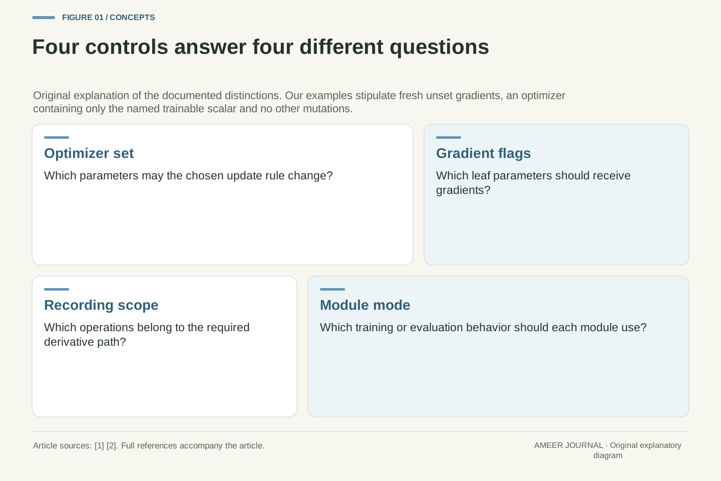
Begin a review with the image’s job. Is it the only content of an action or link? Is it adding information beside real words, repeating those words or simply decorating the page? Is its detail complex enough to need a longer equivalent? Answer these questions from the actual placement, then compare the proposed alternative with the required information.
For the folder link, ask whether the destination can be understood. For the lesson, check the described shape. For the chart, compare every stated value and trend with the source data, then check that the fuller information is reachable. These are different checks; a description can pass one while failing another. A correct noun does not verify a destination, and correct endpoints do not verify a claim that every intermediate value rose.
Microsoft’s workflow includes reviewing and editing generated alt text [4]. That should be a substantive reading decision, not merely accepting the first plausible sentence. An automated check that finds a populated field can establish presence. It does not logically establish that our particular destination, data pattern and information boundaries have been preserved.
Evaluate a candidate against a placement-specific information contract. For P1, the necessary contribution is a destination; for P2, the relevant decision is redundancy relative to text in the same link; for P3, it is faithful visual information. For the chart, identification, units, labels, values, relationships and accessible location of the fuller description are distinct review targets.
A syntactic presence check cannot imply semantic adequacy. In our fixtures, Four vertical bars is a nonempty string, and Increased every week is a grammatically complete assertion, yet neither fulfills the data task. This is a logical consequence of the supplied examples, not a claim that every existing accessibility checker performs only presence checks or lacks more advanced features.
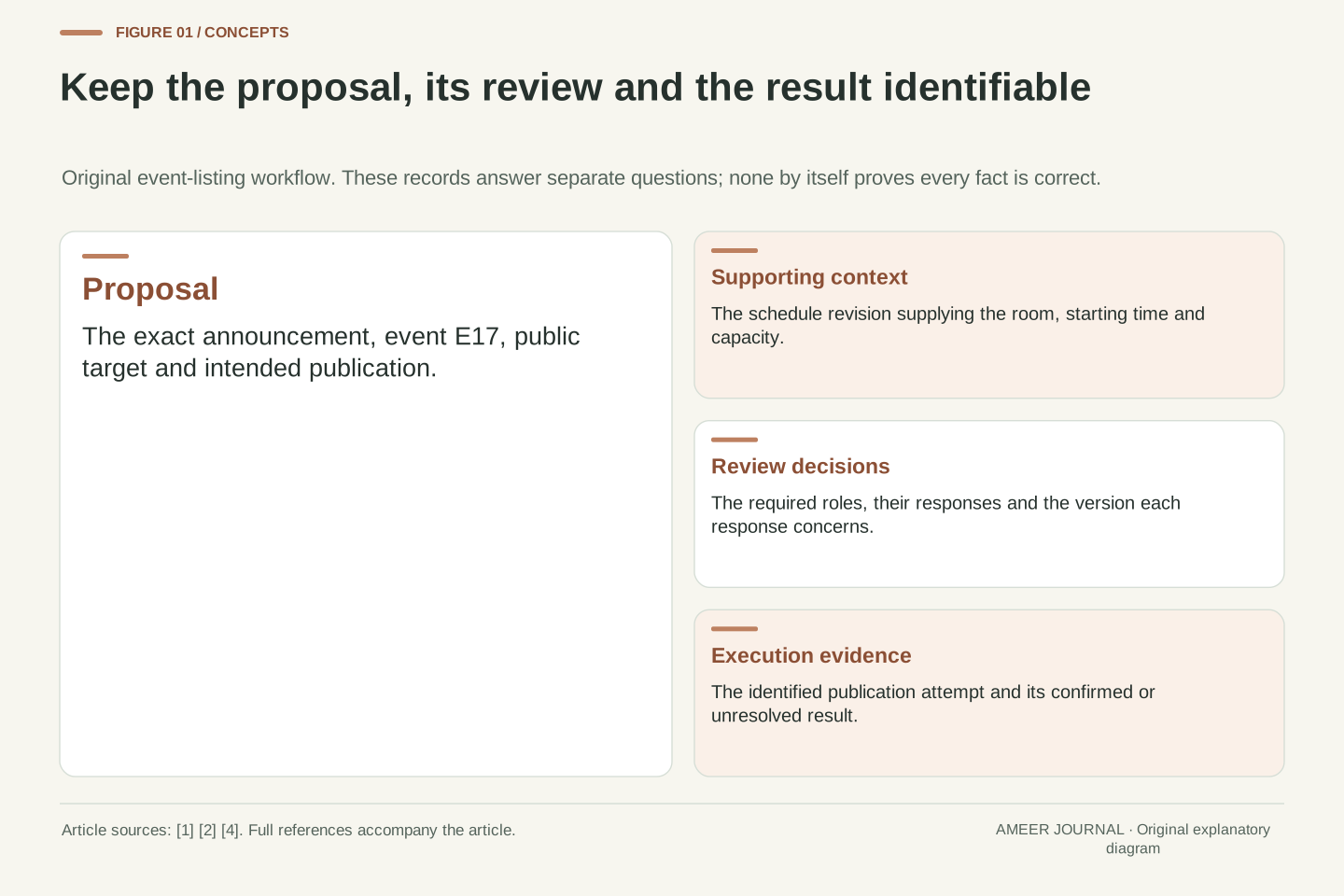
The named Microsoft guidance explicitly provides a review/edit step for automatic proposals [4]. A practical editorial process can record the candidate, the required contribution, the checked evidence and the final revision. Do not invent a confidence score for that process from the proposal’s fluency. If the destination, chart data or intended visual message is unavailable, preserve the unresolved question instead of supplying a more detailed guess.
A previously appropriate alternative can become wrong after a layout change
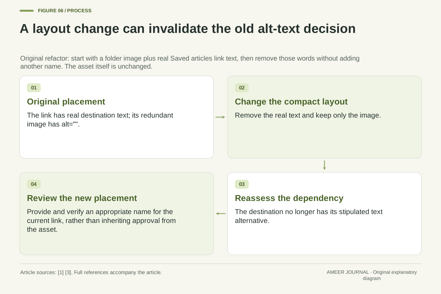
Return to the second folder link, where real text says Saved articles and the image has an empty alternative. Now imagine a compact layout removes those words and keeps only the icon. In our defined example, no other name is added. The previous empty alternative was appropriate for the old layout but no longer supplies the destination that the new image-only link needs.
The image file did not change, so a review attached only to that file would miss the problem. The meaningful change happened in the placement. Conversely, adding real text to an image-only link may change whether the image’s existing alternative repeats information. A responsive redesign should therefore preserve the intended meaning, not just the same visual asset.
Store the decision with enough context to revisit it: image identity, placement, purpose, destination where relevant, text already present, chosen alternative, longer description and review state. When those dependencies change, reassess the decision. This original workflow suggestion follows from our three cases; it is not a promise that recording metadata alone makes an interface accessible.
Treat approval as dependent on the placement revision. Transform P2 by removing its visible Saved articles text while retaining only the image with alt="" and supplying no other naming mechanism. The result no longer satisfies the assumptions that made the image redundant. Its previous approval cannot be carried forward merely because the asset hash remains unchanged.
The dependency record can include assetId, placementId, purpose, target destination, text within the control, relevant surrounding content, selected alternative, detailed-description location and review status. These are illustrative content-management fields, not a proposed web standard. Their function is to identify which changes invalidate the reasoning behind a prior choice.
This is particularly useful when an AI feature suggests text for repeated uses of one asset. A proposal should be associated with the current placement and its evidence, and unresolved dependencies should remain visible. A review workflow can then focus on changed meaning rather than unnecessarily rewriting every unchanged description. The invariant is preservation of the required information in the delivered context, not preservation of a particular string regardless of context.
Check the final use, not just the saved description field
A reviewed alternative can still be lost or attached to the wrong image when content is exported, imported or rearranged. Check the actual delivered placement: the image, its link or surrounding text, the description that was retained and the route to any longer explanation. For the chart, confirm that the values and labels still match the graphic. For the folder, confirm which version of the link actually appears.
Our examples establish why that check matters, but they are not results from a tested website. A real review should record the page version and the browser or assistive technology used for observation. If a compact layout changes the words in a control, inspect that layout’s meaning instead of assuming the desktop arrangement carried across unchanged.
Text alternatives address one part of accessibility. Working keyboard interaction, understandable structure and other requirements remain separate work. The specific contribution here is useful: AI assistance can help propose words, while the final editorial decision preserves the image’s intended role, the facts it conveys and the context in which a reader needs them.
Validate the delivered content against the reviewed placement record. The final image association, control text, alternative value, target destination and detailed-description link can differ from an editor’s preview after transformation. Our original fixtures demonstrate the consequences of some such changes; they do not claim that a particular publishing system has exhibited them.
For an actual implementation, retain the page revision, expected information, inspected structure and observation environment. Check the relevant responsive variants where content or control naming changes. A documented alternative string is evidence of an authoring decision, while the delivered page and observed reading behavior establish whether that decision survived implementation. Neither should be silently substituted for the other.
The scope remains text alternatives in defined image placements. It does not certify every WCAG criterion, interaction pattern or jurisdiction’s legal requirements. Within that scope, the important separation is actionable: visual accuracy, functional meaning, redundancy, complete data and structural access are different properties. Evaluate them against the actual image use so that a plausible AI-generated caption becomes a considered alternative, or is revised when it does not fulfill the reader’s task.
Sources & further reading
Explore the references behind this guide. External pages may change after our review.
- Functional Images | Web Accessibility Initiative (WAI) | W3CW3C WAI · Accessed 7 Nov 2026
- Complex Images | Web Accessibility Initiative (WAI) | W3CW3C WAI · Accessed 7 Nov 2026
- Decorative Images | Web Accessibility Initiative (WAI) | W3CW3C WAI · Accessed 7 Nov 2026
- Everything you need to know to write effective alt text | Microsoft SupportMicrosoft · Accessed 7 Nov 2026
Article updated 7 Nov 2026.
Found something we should revisit?
Good explanations get better with thoughtful feedback.